McCay Tool and Engineering
Web Development
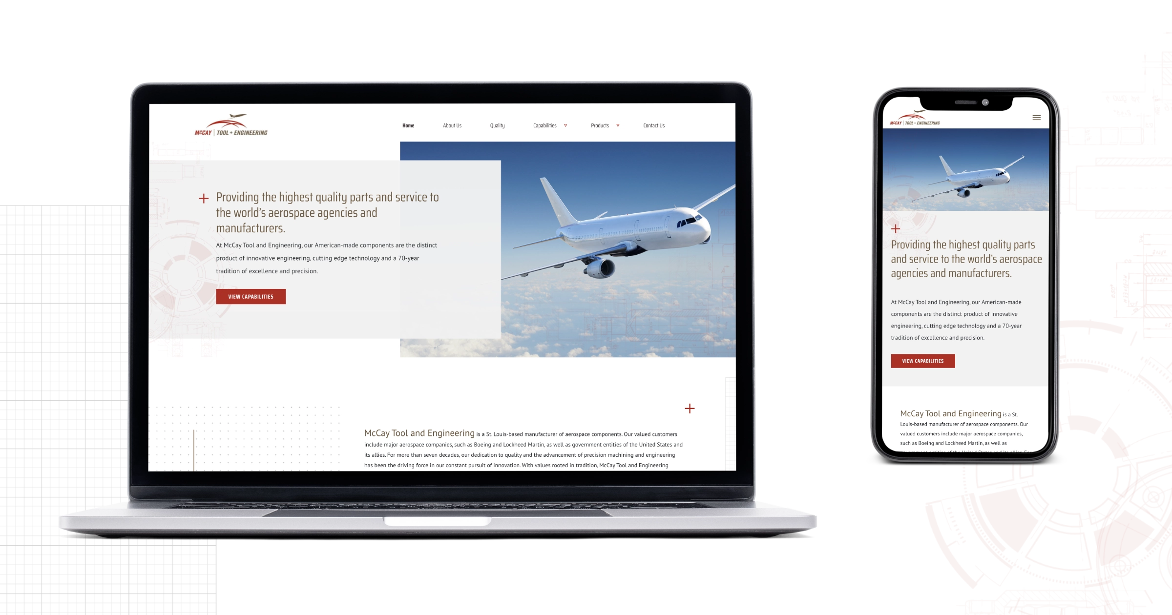
McCay Tool and Engineering came to Timmermann Group for a website refresh. Our team aimed to improve search engine rankings and attract qualified leads, showcasing points of differentiation from competitors in hopes of gaining market share and diversifying client base, and much improved visual design with high prioritizations of the user experience for users on a variety of screen sizes.
Web Address: mccaytool.com
My Role: Web Developer
Designer: Katie Coughlan
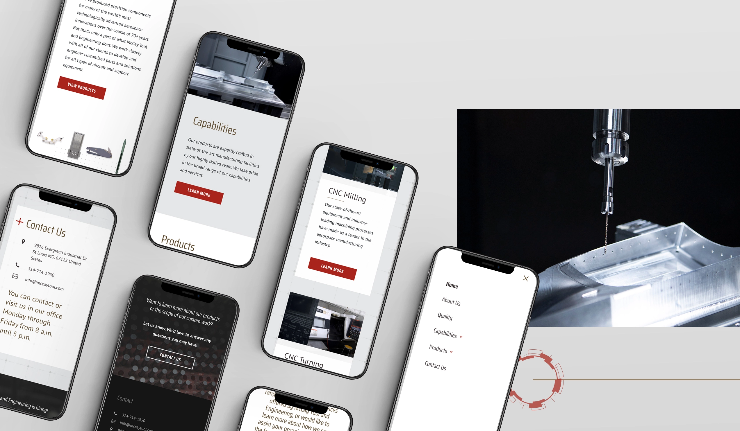
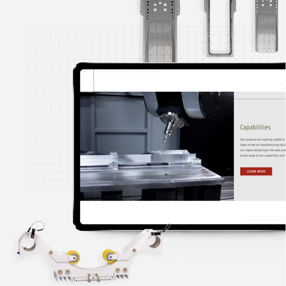
Responsive Decorative Elements
This project involved managing a significant number of decorative elements while ensuring the design remained fully responsive across various devices. Each schematic illustration needed to adjust its positioning fluidly, maintaining visual harmony on different screen sizes. To achieve this, I utilized CSS pseudo-elements, allowing for precise control over the layout and responsiveness without adding extra HTML markup. This approach kept the design clean and flexible, while ensuring an optimal user experience across all device types.
Mobile-First Development
As with many modern websites, this project required a mobile-first approach to ensure optimal performance on smaller screens. To maintain a responsive yet consistent grid layout, I utilized the grid system from the Bootstrap 5 CSS framework. Additionally, I implemented Bootstrap’s collapse plugin, extended a WordPress navigation walker class, and integrated custom JavaScript to create an animated mobile navigation. This combination of tools ensured a seamless and interactive experience across all devices.
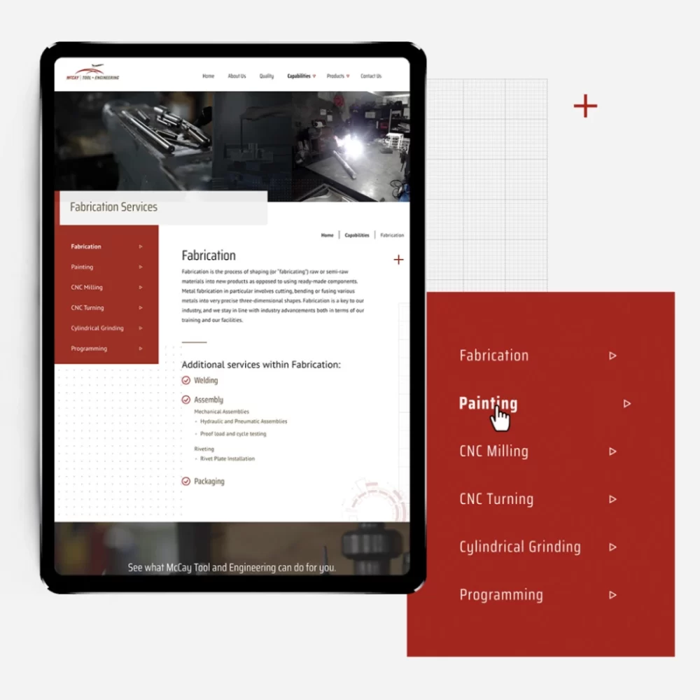
Flexible and Scalable Design System
The strategy involved separating pages, services, and products into distinct sections, allowing for customized template designs tailored to each. Flexibility and reusability were key requirements, along with ensuring the design could scale to accommodate future updates.
Content separation was achieved by registering custom post types in WordPress and developing unique templates for each, ensuring that each section had a distinct and tailored design.
To ensure flexibility and reusability, I utilized the Advanced Custom Fields (ACF) plugin and developed a series of reusable page sections that could be easily applied across different templates.
To incorporate scalability, I employed Object-Oriented PHP and adopted an atomic design methodology. This approach allowed design elements to be modular, enabling them to be combined in various configurations as the site evolves.
Hire Your Next Web Developer Today!